Lilly-jo Cullen


Learning Experience Design
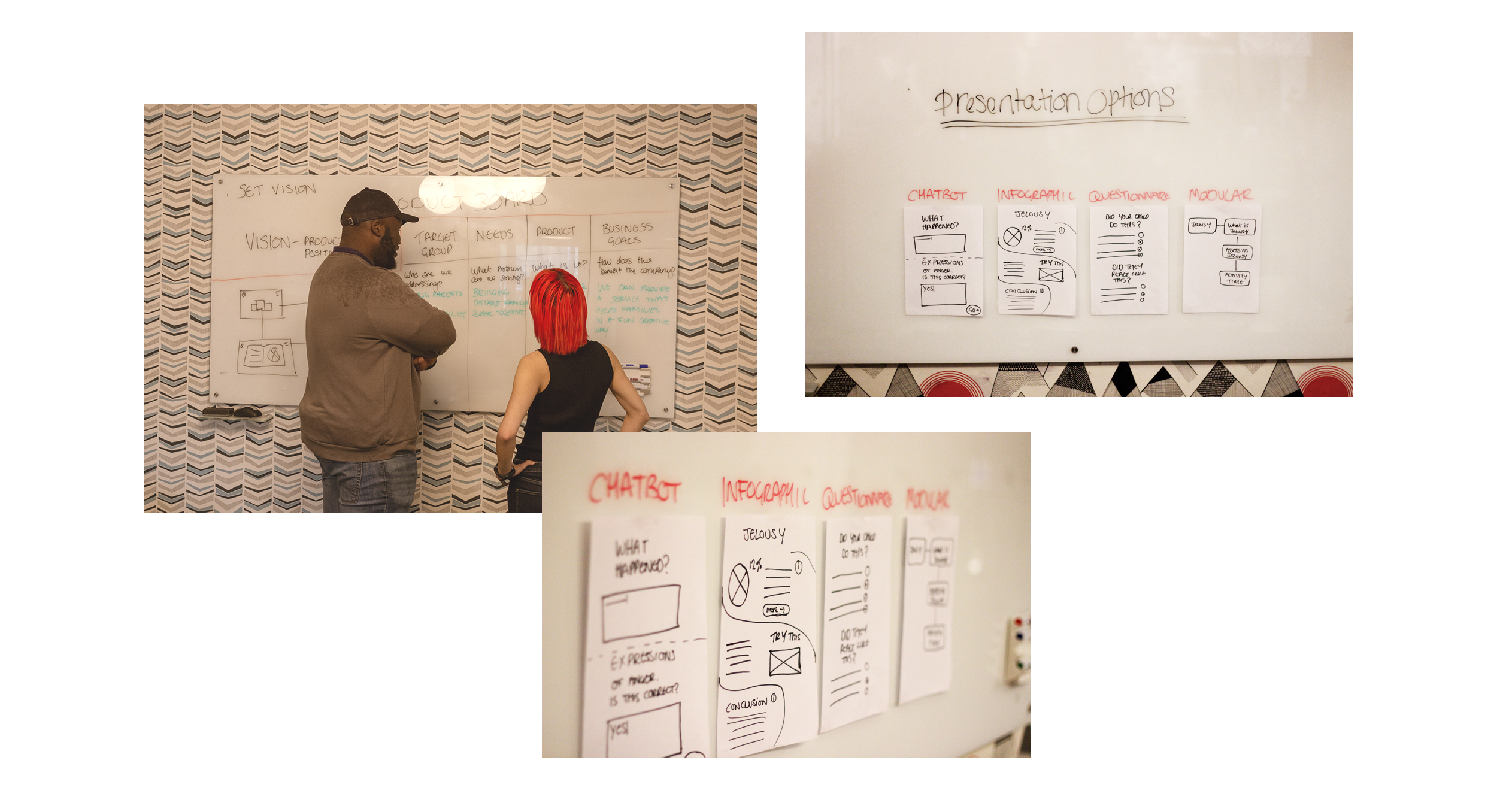
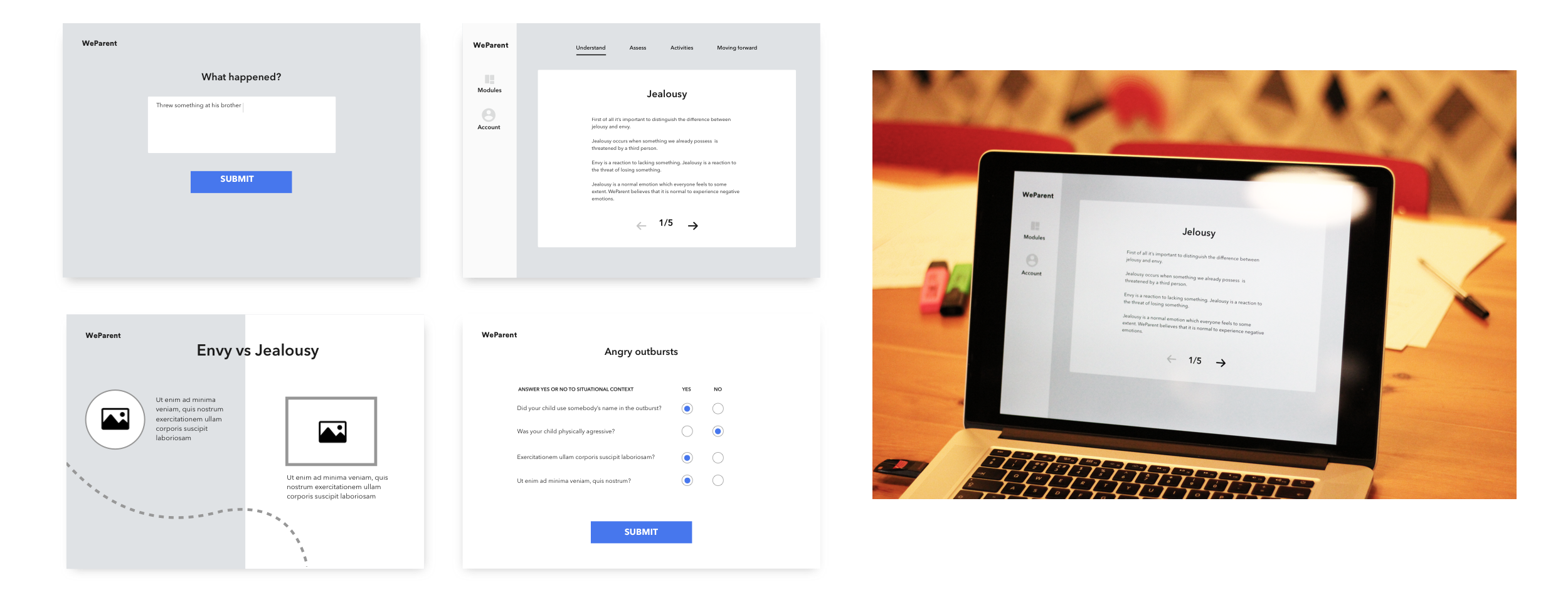


Project “Microdose”

Some details have been changed for confidentiality purposes.


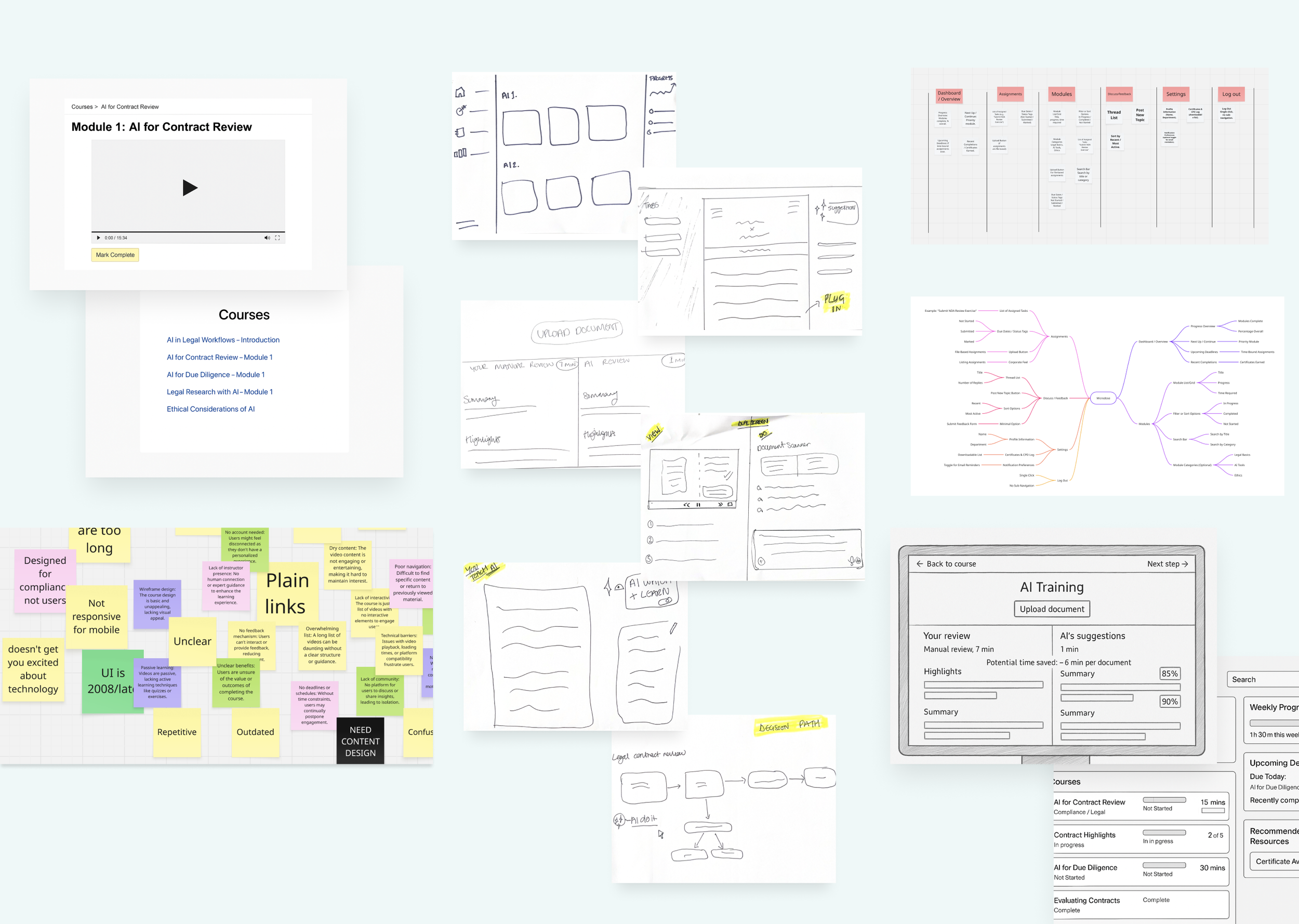
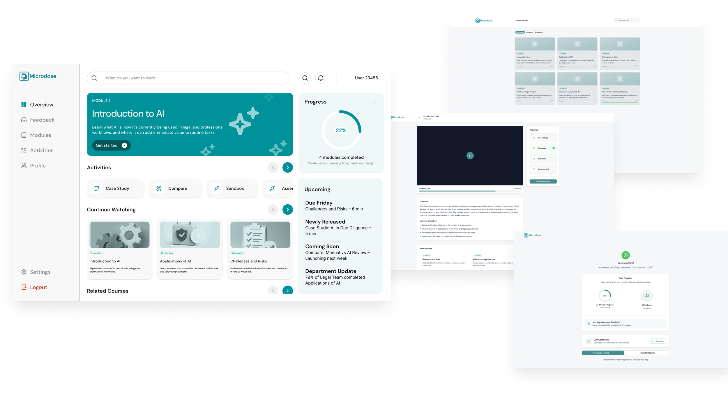
I was brought in on a flexi-freelance basis to support an internal pilot for a consultancy exploring how professionals could integrate AI into their daily workflows. Starting from a basic collection of static links, I created a simple course architecture and lightweight UI to turn the content into a cohesive, testable experience. Suggestions for minimal functional enhancements were made to help the material feel more like a structured course rather than a disconnected set of resources.

The work gave the consultancy something tangible to share internally and with select stakeholders, enabling early feedback on both the format and its potential value. While still early-stage, it provided a foundation for future scaling and positioned the idea as a credible addition to the consultancy’s service portfolio.
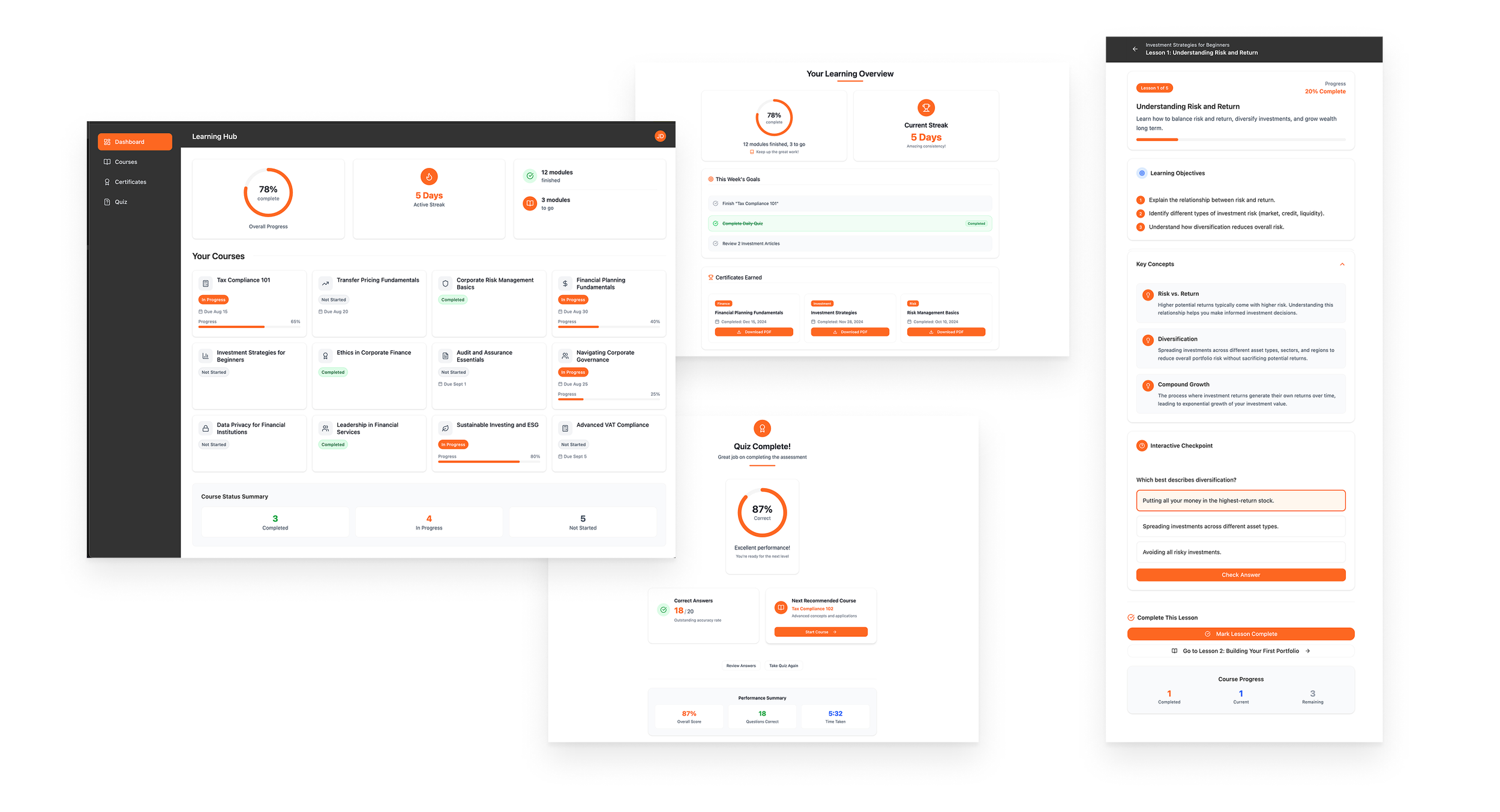
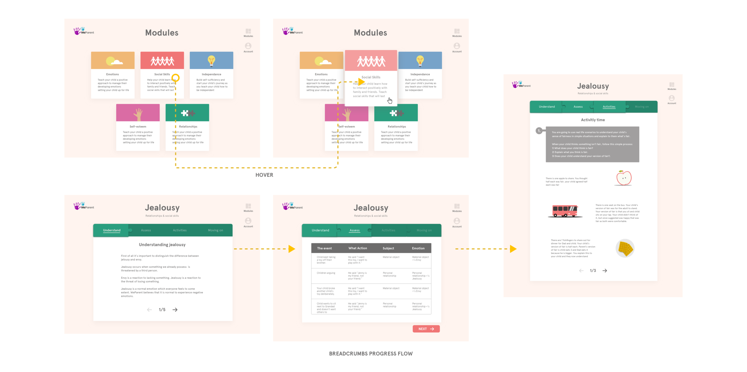


Praxis Labs


As the first dedicated product designer on Praxis Labs’ New York-based team, I took the non-VR learning experience from static word documents to a fully interactive, dynamic course. Designed end-to-end introducing content structuring, visual hierarchy, and interactive components to make dense, long-form material feel intuitive and engaging. Established reusable templates and design patterns, enabling the team to rapidly scale future course production.

The redesigned experience transformed how Praxis delivered its content, evolving from a basic document-driven approach to a professional, scalable learning product. The structured templates and improved usability became the foundation for subsequent course rollouts. Praxis Labs has since been acquired by Torch, with this product forming a key part of its learning portfolio.


WHO


I joined as a freelance designer through an agency to provide execution-focused UI and UX support for an AR mobile app developed with WHO and Meta. Working within preestablished patterns, I contributed to refining interactions, ensuring visual consistency, and extending the design system where needed.I also designed the onboarding flow end to end, making AR setup and first-time use straightforward for health professionals operating under intense time pressure.

The app played a crucial role in getting critical PPE training into the hands of health professionals quickly during the pandemic. By simplifying onboarding and aligning UI patterns across the experience, we helped make the tool fast to adopt, ensuring protocols could be learned and applied reliably in high-pressure, real-world environments.


PwC Insights (Learning Hub)


Working within a design agency I joined the UX, UI, and illustration on PwC’s Insights and Learning content hub, exploring how traditionally static blog and article content could be restructured into something closer to a course experience. Within the constraints of PwC’s strict brand guidelines, I worked on early concepts to introduce clearer learning pathways, breaking dense financial topics into more digestible sections and using subtle icons, signifiers, and improved navigation patterns to guide users through related content.

This work helped shift the perception of the portal from being a passive library of articles to something with more structure and flow, encouraging longer engagement and easier knowledge discovery. Alongside other initiatives, these early ideas around course-like sequencing and visual signposting later evolved into what is now the PwC Learning Lab.


WeParent


The brief was to turn a large, text-heavy library of child psychology expertise into a mobile guide that busy parents could use to tackle specific behavioural challenges. Through workshops, we defined key personas, their needs, and the product vision, focusing on how to guide users directly to relevant advice without overwhelming them. We developed and tested several approaches before settling on a modular, step-by-step system, organising content into “Understand, Assess, Activities, and Moving Forward” sections.

This structure made complex information easy to scan, refer back to, and share with others involved in the child’s care. Parents found the clear, sequential flow helpful for understanding issues and applying advice in real life. The modular approach became the foundation for the app’s content delivery, turning what was once static information into an actionable, user-friendly tool.